I've been so caught up with new ideas lately that I've been neglecting the important and very practical step of making my finished works available online. Therefore, tonight's Sonnet & Mayhem activities were focused pretty much exclusively on putting the first of five new card sets up on my etsy shop. I'm hoping to have the rest up by the end of the week.
I also had the pleasure of filling my first cross-Atlantic order this evening and I couldn't help but feel a little awe at the fact that one of my humble little cards will soon be heading to Europe. Definitely a moment that re-confirmed my desire to keep experimenting and making better prints and cards.
I have the apartment all to myself for the next few days and I'm planning to take full advantage of the extra space and solitude. I'll definitely miss having T around to torture with my endless crafting questions (Would you call this cream or eggshell...?), but I'm hoping that some quiet time will translate into some serious productivity. Either that or I'll spend the next few evenings singing show tunes really loudly while eating mustard and pickle sandwiches and watching Glee. You know, the usual gal-at-home-alone stuff.
Monday, September 28, 2009
Sunday, September 27, 2009
Oh, Letterpress... This Might Be Love
I headed out bright and early this morning to attend my first letterpress workshop and boy am I glad I decided to sign up! Not only did I finally get to see, understand, and operate an antique tabletop press, but I also got to meet some amazing Toronto-area artists and find out a little bit more about some of the fun, artsy things going on in the city.
Having long followed Tanya's Snap & Tumble blog, it was great to meet her in person and see the detailed and complicated process through which she creates her letterpress cards. I also got to meet Tanya's lovely best friend, photographer Ingrid Punwani, and fellow letterpress admirer Adrienne.
After agreeing on a striking shade of blue ink, we moved on to a huge tabletop full of letterpress text pieces and started planning out our experimental phrases. Seeing all of the blocks lined up ready to be placed into endless combinations - heaven!
I loved working with the full sets of metal type, but I must admit that I have a soft spot in my heart for the jumbled set of wooden blocks that Tanya has as well. Matching up the misfit letters to create little words was almost as much fun as printing them out.
However, in the end I opted to use the metal sets for my prints. I had a bunch of little ideas written down and chose to print out the ones that not only worked as their own phrases, but could also be used for some other projects and gifts I have flitting around in my notebook.
I'm hoping to actually add pen and ink drawings to some of the 'Pen & Ink' prints I made and my favourite print of the day, the 'constellations' print pictured below, just might end up being the cover of a new little writing collection. Oh, the potential!
My letterpress mates produced some amazing prints as well (and shared a few samples with me), including a great 'Yarn!' text print using the woodblocks and a sweet 'XO' image that might go into hiding until I can give it to T for Valentine's Day.
After spending a few hours with the press, it's not hard to see how one could quickly become obsessed with printing this way. Lining up and printing the text by hand is incredibly gratifying and the end result has such a polished, tactile beauty that it almost makes you wish everything was still printed this way. (Although, this would make my job as an editor decidedly more complicated).
The workshop just flew by and I could have easily spent three times as long just playing with the type. Now I'm back at my own decidedly smaller work space (i.e. my kitchen table) with a stack full of beautiful letterpress prints and a huge amount of inspiration for other projects. Definitely an excellent way to spend a Sunday!
Having long followed Tanya's Snap & Tumble blog, it was great to meet her in person and see the detailed and complicated process through which she creates her letterpress cards. I also got to meet Tanya's lovely best friend, photographer Ingrid Punwani, and fellow letterpress admirer Adrienne.
After agreeing on a striking shade of blue ink, we moved on to a huge tabletop full of letterpress text pieces and started planning out our experimental phrases. Seeing all of the blocks lined up ready to be placed into endless combinations - heaven!
I loved working with the full sets of metal type, but I must admit that I have a soft spot in my heart for the jumbled set of wooden blocks that Tanya has as well. Matching up the misfit letters to create little words was almost as much fun as printing them out.
However, in the end I opted to use the metal sets for my prints. I had a bunch of little ideas written down and chose to print out the ones that not only worked as their own phrases, but could also be used for some other projects and gifts I have flitting around in my notebook.
I'm hoping to actually add pen and ink drawings to some of the 'Pen & Ink' prints I made and my favourite print of the day, the 'constellations' print pictured below, just might end up being the cover of a new little writing collection. Oh, the potential!
My letterpress mates produced some amazing prints as well (and shared a few samples with me), including a great 'Yarn!' text print using the woodblocks and a sweet 'XO' image that might go into hiding until I can give it to T for Valentine's Day.
After spending a few hours with the press, it's not hard to see how one could quickly become obsessed with printing this way. Lining up and printing the text by hand is incredibly gratifying and the end result has such a polished, tactile beauty that it almost makes you wish everything was still printed this way. (Although, this would make my job as an editor decidedly more complicated).
The workshop just flew by and I could have easily spent three times as long just playing with the type. Now I'm back at my own decidedly smaller work space (i.e. my kitchen table) with a stack full of beautiful letterpress prints and a huge amount of inspiration for other projects. Definitely an excellent way to spend a Sunday!
Saturday, September 26, 2009
Paper Shopping... My Favourite!
Today was a busy day running around the city. T bought new glasses (black framed nerd glasses - so cute!) and I had my own adventure buying paper for tomorrow's Letterpress Curiosity Workshop by Snap and Tumble. I needed to find a very specific type of paper (hopefully, I picked up the right one!) and then cut it down into manageable pieces. I can't wait to check out Tanya's press tomorrow and will definitely post the results.
Now I'm off to brainstorm some text ideas to print!
Wednesday, September 23, 2009
Snowflakes... Too Soon?
I wasn't going to post pictures of my snowflake card experiment, but my sister saw them today and reacted to them far more positively than I anticipated (Thanks, TJ!). I printed this card with my other card sets on the weekend, but they were relegated into the 'test' pile until tonight.
It's a bit hard to tell, but there are actually three different colours of ink on the print (the three colours show up better when you're physically holding the card). I thought they looked a little amateurish, but maybe there's still hope for the print.
Sunday, September 20, 2009
Card, Set, Match
Disclaimer: I've been advised (by my not so helpful husband and my no-good best friend) that this post title is too ridiculous, but I'm going to stand by it.
I went a little crazy with my poppy print today. Yesterday, T and I went to a friend's wedding and, with only seconds before we had to head out the door, I printed up a quick poppy card for the gift. The card turned out so well that I devoted the entire afternoon to creating new cards sets with the print.
I was really happy with how the sets turned out, especially the aqua/greenish colour set with the orange poppy. I'm still working out how I'm going to package the sets of four though. I really want it to be something special, but the ideas I've tested out so far obscure the actual card too much, so I'm going to have to brainstorm a little more.
Friday, September 18, 2009
Step One: Colour Inspiration
The perfect remedy to my apartment decorating angst arrived last night in the form of two gorgeous pillow covers that I ordered off of etsy from milk & cookies canada. The shop features a huge array of pillow covers made with stunning fabrics. It was definitely difficult to choose just one favourite to work with.
We've got a brand new grey couch all picked out for our post-painting furniture buying spree and these pillows are not only going to work perfectly with the charcol grey fabric, but will also be our colour reference when making other decorating choices (Accent wall!). Now if only we could get some white on those windsurfer walls...
Thursday, September 17, 2009
Full Days
Lately, I've been feeling that there simply isn't enough time in each day to work on all of the things I'm trying to do. Between my job, the gym, keeping the apartment in a somewhat respectable state of cleanliness (don't even get me started on when we're going to finally get the chance to re-paint and decorate it!), and assorted social functions, the amount of time I have left for working on art projects has been getting slimmer and slimmer. This isn't meant to be a complaint because I love having lots of things on the go, but it does get frustrating when I can't move forward with creative ideas or get through more than five pages of an amazing book without seriously compromising the amount of sleep I need to remain pleasant and functional.
I think part of the reason my time is feeling a little condensed is that I've been daydreaming up all sorts of potential mixed media projects in which I could incorporate my prints. Before I started this particular project, I was dabbling in all sorts of other things - bookbinding, concrete poetry (any b.p. Nichol fans in the house?!), my beloved pen and ink - and inevitably some of my older ideas have started resurfacing. Linoblock print meets concrete poem! Huge potential. Stamped print plus hand drawn ink illustration. Could be amazing. I can easily think of a dozen projects I would like to try... if only I could magically have enough time (and, if I'm going to dream about ideal situations, a huge studio space) to actually make these things. The cost of the materials isn't even that high, it's just the time it takes to assemble them.
Hopefully, I'll have a few opportunities to get some serious work done in the next few weeks. Sadly, I just found out that I didn't make it into City of Craft. This wasn't totally unexpected as I'm such a new participant in the craft scene and I know it's extremely competitive to get a spot. I'm definitely disappointed about not being able to participate as a vendor (although, I'll be there with bells on as a buyer come December). Luckily, my alternative fall plan involves registering for Open Studio's printmaking workshops, so I've got a whole new project/learning experience to work towards.
All this fussing aside, and with a brief pause to acknowledge that I am responsible for more than a few wasted hours myself (Mad Men and Glee episodes anyone?), I'm pretty excited about some of the random new ideas I've been jotting down in my trusty pink notebook. Also on the horizon... Christmas presents! (And, no, it's not too early to start!)
Monday, September 14, 2009
Fifty Posts... Wow!
It's been a busy week with a very strange mix of good and very sad news.
One of my closest friends lost her father to pancreatic cancer a few days ago - a truly heartbreaking loss. I knew very little about this terrible form of cancer a few months ago, but I've become much more knowledgeable about it through my friend and her efforts to raise awareness and funds for research (you can read more about pancreatic cancer and donate here).
With T's job in full swing and my little sister now in the city (and pretty much my new neighbour), it's been hard to find time to sit down and finish the stamps I started last weekend. It wasn't until this evening that I was finally able to carve the snowflake and then do a quick test run of each of the stamps. After more than ten hours of carving, I really wanted to see how these things were going to turn out.
First up was the snowflake. I was a little worried about the design, especially when I noticed that the individual branches weren't quite even. The prints ended up being quite pretty though, and the stamp worked well with a variety of ink consistencies and patterns. Should be a handy little stamp as we inch towards (dare I say it) winter.
I was much happier with my test of the poppy print. I've been looking for a simple image to create a set of lovely thank you cards and I think this print will be perfect.
The biggest disappointment of the four was definitely the key stamp (sorry Grace!). The stamp produced a clean image, but I just don't like how the design of the key translated on linoblock. If I try another key, I'll likely aim for either a much more ornate design, or a very simple version of what I have now (i.e. no more crazy loops).
I'm also a bit on the fence about the sea horse print, although the stamp itself produced a strong, clear print. I've decided to reserve judgment on this one until I test it out on some of those fabulous aqua cards I've got tucked away. Maybe with some white ink...
With everything going on this week, I also forgot that this post was going to be my 50th Sonnet & Mayhem post! Cue balloons, confetti, cake, and a brass band (with extra french horns, of course).
I can't believe I've reached 50 posts! When I first started this blog, I wasn't even sure if I'd keep it up more than a week or two. It's been an amazing experience to write about this crazy project and have such amazing feedback (thank you readers, family and friends!). I have lots of plans for Sonnet & Mayhem in the next few months, so hopefully there will be a lot more of these to come!
Tuesday, September 8, 2009
Progress
I wasn't in the most motivated of spirits tonight, but I forced myself to start carving the key stamp. Of course, once I'd finished the ornate top of the key, I figured I might as well just finish the job.
I'm still holding back on testing the blocks until I get the dreaded snowflake one carved. So many tiny features, so much room for error. At least with the snowflake a few little imperfections shouldn't ruin the print. I mean, nature is rarely perfectly symmetrical, right?
Monday, September 7, 2009
Wine, BBQ, Poppies, Sea Horses...
Okay, so sipping wine and visiting friends may have won over much more of my long weekend than I anticipated. But with weather like this, I have no regrets!
After spending most of Saturday and Sunday eating great food, reading, walking along Queen West, and visiting with friends, I finally sat down today and got to work on not one, but four new stamps.
After focusing on some fairly specific technology-themed designs, I wanted to work on a series of simple images that lend themselves to more versatile card sets. Having unique stamps is great, but it's not so fun when I'm rooting around for a thank you card and find that my options consist of outdated computer discs, ampersands, and the Pi symbol. Sometimes a gal just needs a flower print (and the rose print needs a break).
I didn't want to miss out the sunshine, so I set up shop on our balcony.
The images I drew were pretty ornate, so I ended up only having time to carve two. I'll tackle the other ones tomorrow and then have a big testing marathon.
With four new stamps on the go, I'm thinking at least one has to turn out. The poppy one is a bit of a question mark, but the sea horse stamp looks much more promising. Plus, my sister already requested a sea horse print for her bathroom. Definitely a good sign!
Friday, September 4, 2009
Libraries are Amazing
The first week of September always makes me nostalgic for university. On a day like today (my last free Friday afternoon before summer hours end), when the weather is perfect for that first stroll through campus, I miss the feeling of blissful optimism I always felt when starting a new academic year.
I loved school and loved being a student. And it wasn't just the freedom to work and play whenever I wanted, although that was certainly a perk. I loved school because it meant that my job was to read incredible literature, think deeply and critically about it, and then write about it in pretty much any form I wanted. I loved having a built-in network of like-minded souls that met weekly simply to analyse and debate books.
Granted, my current job also entails reading academic material, thinking critically about it, and writing responses. In fact, that's exactly what I was doing this morning. The big difference is that now I'm editing business law and statistics texts, whereas at university I was leisurely making my way through the greatest works of English literature. Same skills, totally different connection to the material.
Of course, the great thing about loving to study is that there's really no reason not to keep tracking down new things to research, and it is exactly this fact that sent me wandering though the Toronto Public Library this afternoon in search of new material. I didn't even have a specific goal in mind when I started looking through the shelves, but my recent foray into art deco printing soon drew me to the art history section. Low and behold, there in the modern art section was a book that I've been secretly coveting in Indigo for months: Peter Gay's Modernism.
Don't ask me why it never occurred to me to look for this book in the library before. For the longest time I've had my heart set on buying it (even though it comes with a nearly fifty dollar price tag), so I guess I just assumed that eventually my artistic curiosity would get the better of my fiscal good sense and I'd plunk down the money for it. Now, I have it for free (err... we'll just skip over the part where I had to pay a $15 fine for my last library check outs...) and I'm so excited to start reading it.
So, voila! Book learnin' just like the good old days, minus tuition, book store lines, and my woeful Value Village wardrobe (oh yes, now I'm starting to remember the perks of not being a student).
I hope everyone is having a lovely start to their long weekend/school year/September! I have some significant printing plans for this weekend (along with plans for sipping wine in the sunshine and visiting great friends), so stay tuned!
Wednesday, September 2, 2009
Experiments Are Expensive...
...and so are mistakes. Not as expensive as having to buy a new digital camera, of course, but definitely not cheap.
This was the primary lesson for this evening's printing session involving my new art deco stamp and my decidedly older Chrysler building stamp. I was sure that the two stamps would work well together, but it just wasn't meant to be.
The image and text ended up looking awkward no matter how many variations I tried, and even attempts to create a workable combination with gradients and shadows went down in flames. Long story short, I destroyed A LOT of cards (and not just the front, but every possible card surface of most of the nice white and coffee cards I had left).
Thankfully, I did create a few nearly successful cards using just the art deco stamp.
I broke out my trusty red ink in order to jazz up a simple white card.
Unfortunately, on closer inspection I realized that I have some alignment problems with the art deco stamp and they really stand out when I'm trying to create a stark, linear image on the cards.
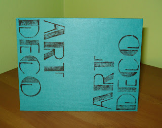
I also tested the stamp on one of my new pieces of cardstock.
This lovely aqua card is part of a multi-coloured box set of cards that I discovered at Michael's on the weekend. I wasn't sure about the investment at first, but now I can't wait to start a serious printing session with these beauties.
I just hope that I don't burn through this set as quickly as I did my other card stock tonight.
Subscribe to:
Posts (Atom)