100 THINGS
Click here to see my full list of goals for 2010

Monday, August 31, 2009

Art Deco

Among the many design passions I harbour is a long-standing and unshakable love for art deco. In particular, I'm enamoured with the symmetry and precise line work of art deco stained glass and architecture (it's no coincidence that my first stamp was the Chrysler building). It's the type of affection that made my first visit to the Empire State Building a divine (although, extremely crowded) experience.

However, my deepest love is reserved for the pure drama of art deco fonts and ever since I started experimenting with text stamps I've been plotting to make the perfect art deco print.

I was feeling particularly inspired last night, so I tracked down a gorgeous font sample and carved an art deco style stamp from one of my wood/lino-blocks. Because of the complicated design, I decided not to draw the initial image freehand (as I've done with all of my other stamps). Instead, I printed the text and scored along the key lines first. You just can't mess with the lines in a font like this.


I went pretty literal with the phrase art deco, but it just seemed so perfect that I couldn't resist. Now that I know how to replicate the font cleanly, I'm sure I'll be carving out some additional, card-appropriate phrases.

My first test print turned out so well that I actually shouted OOOHHHHHHH YEEEEAAAAHHHHHHHHH! and did what can only be described as a post-touchdown, end zone dance. I share this with you not because I like to ritually embarrass myself in front of my friends and readers, but because it's the clearest illustration of just how happy I was that the print turned out.

Up next: Determining if this new print plays well with the Chrysler building image!

Sunday, August 30, 2009

Creating... with Sugar!

After a few days of feeling under the weather, I rebounded yesterday with some brainstorming and some baking.

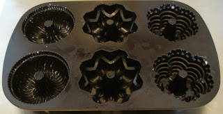
My inspiration was a set of fancy cake pans that I received as a wedding gift and had not yet tried out. The pans came with a recipe book and I decided to aim high by selecting the 'Orange and Chocolate Marble Cake' as my test recipe.


My chocolate and orange sauce drizzle didn't really do the cakes any aesthetic justice, but taste-wise everything came together in the end.

Wednesday, August 26, 2009

New Etsy Post!

I'm still working on the packaging for the Ampersand card sets, but I created a few extra single cards that are ready to head out into the world on their own. If the double ampersand prints makes your heart flutter, it's now available on my online shop.


Tuesday, August 25, 2009

Sonnet & Mayhem is... considering Facebook?

After a productive weekend, it's literally back to the drawing board for me. I need to keep the new stamps coming so that I have new images to experiment with in my prints. I also need to post some new products on my lonely etsy shop. I've got the cards ready to go, but finding the time to take great pictures and write compelling marketing copy has been harder than I thought.


With my City of Craft application in, I also have more time to focus on some other projects, including continuing to develop the readership of this blog. I'm so happy with the readers I have now (thanks, everyone) and I do hope the number of readers I have grows organically. On the other hand, I need to be proactive about spreading the word about my work in interesting and constructive ways.

One of the big choices I'm wrestling with right now is whether I should set up a Facebook profile (not for Sonnet & Mayhem, but for me personally) or Twitter account. On the surface the decision seems like a no-brainer: more connections = more readers. But I'm also hesitant to branch out into too many online forums and risk spreading my time for the project too thinly. Should I embrace tweets and status updates? I'm still a little on the fence.

Any thoughts on this question would be most welcome!

Sunday, August 23, 2009

The Classics

More prints today. This time I returned to classic black with the occasional dash of blood red (just to keep things interesting). I had a few less disasters than yesterday, which is probably a good thing for my nerves. I can just see myself in the doctor's office in a few months trying to explain to my GP why I have the blood pressure of Bay Street lawyer. It all started with this stamping project, you see...

I stuck with the ampersand print and focused on testing out some new patterns. After printing the stamp hundreds of times, I'm really starting to get a good sense of how much ink to use. Of course, the downside to so much use is that my poor little stamp is already starting to fray.


I'm really loving the ampersand print right now and the single red image is my favourite. However, I'm ashamed to admit that it took me three tries to get this print right because every time I was close to being done I realized that I'd placed a black stamp in the place I'd marked for the red one. I definitely need to work on my focus.


And with all of my new little repeating stamps, my collection is really starting to grow. One of these days I'm going to have to get a new box for them all!


I'm also happy to report that I wasn't the only one in creating mode this afternoon. Look at the delicious chocolate stout cake (more of a bread pudding, really) that my husband made for desert tonight. A man who can cook and give me feedback on my crazy stamping project. What a catch!

Saturday, August 22, 2009

Prints, Prints, Prints

I tackled some new print experiments today and decided to make things a little more interesting by adding some deep blue and yellow to my range of speedball inks. With pretty much every colour in the rainbow at my disposal, I was able to create some interesting gradients.


I even tackled the dreaded rose print again (which officially makes me a stamping masochist) and I liked how the print looked when I took the time place the images evenly. A bit wallpaper-ish maybe, but I think there's more potential there.


Also on deck, my much underused Chrysler Building stamp. It doesn't work well as a repeating stamp, but I thought I would play with it a bit anyway... if only because I should use it more often than I do.


I also made a couple of measured typewriter and disc stamp prints in all black, leaving me with about five polished prints and a bunch of ideas to pursue again tomorrow. I just need to figure out all of the rest of the details that go along with pricing and packaging them. Definitely not a job for Saturday night.

Thursday, August 20, 2009

Hello, Pencils! Hello, Books!

I'm not sure if it's the rapid approach of September or the fact that T is sharpening his pencils for his own first day of teaching, but I've definitely had education on the brain lately.

I've been pretty content with my own little experimental operation to this point, but as I fill more and more pages of my notebook with design ideas that won't quite work with linoblock, I've started taking a closer look at affordable opportunities to expand my range of skills.

Last year, before this whole stamping adventure started, I had a similar educational urge and took a drawing class with Wren (best friend, upstairs neighbour, camera lender, phenomenal artist) at George Brown College. The class was interesting, but also a bit pricey (especially considering the highlight of the thirteen weeks was simply having a motionless, real-life model to draw from).


This time, I'm looking for a classroom experience that's a little different (and also one that doesn't require a 13 week commitment - not always easy when my job gets crazy).

Naturally, I was delighted when Toronto-based designer Tanya from Snap & Tumble decided to begin offering workshops on her Craftsman Machinery Press. I've been following Tanya's blog since I came across her stunning letterpress cards at City of Craft a few years ago and now that I have a coveted spot in one of her weekend Letterpress Curiosity Workshops, I will actually get a chance to see the press in action.

Of course, much to my husband's relief, I'm not actually planning to go the letterpress route myself. The old fashion presses produce such beautiful imprints and images, but I can barely keep my little hutch closed with the carving supplies I already have (and the biggest piece of printing machinery I own is my little carving tool). I'm more interested in the Letterpress Workshop for my own artistic curiosity.

In terms of expanding the range of products and styles I can create for Sonnet & Mayhem, I've been looking at a set of classes available through Open Studio. Open Studio offers a 4-week Power Printmaking Course (kind of sounds like a cardio class, right?) that provides a basic demonstration of four different types of printmaking: relief, etching, lithography and screenprinting. I know a little bit about each of these types of print media, but not enough to decide which style might be best suited to the types of prints and cards I would like to make. These courses seem like the perfect way to figure out what method I want to learn in more detail, especially if I invest in more courses in the future.

With all of these learning opportunities on the horizon, I must admit that I'm feeling a little back-to-school excitement. Although, I might just be looking for an excuse to go back-to-school shopping...

Tuesday, August 18, 2009

Yet Another Reason to Love Design*Sponge

Design*Sponge has long had a leading spot in my daily blog rounds. The constant stream of incredible design and creative ideas never fails to inspire me. However, today my love for the blog grew x10 when I saw this beautiful post by D*S editor Amy Merrick (also behind An Apple a Day).

I love Little Women and the 1994 movie holds an extra special place in my heart because watching it was one of the last things my roommates and I would do every year before heading off for Christmas holidays. So, when I saw Amy's point-by-point design guide to some of the film's best scenes, it not only reminded me how stunning the film is, but also how much I love the dark wood, quill pens, and brass work of the era.

Reading the post also stirred up memories of the fiery debates I used to have with my roommate Emily about which of the film's two leading men were worthy of our love. Em was firmly in the Laurie camp, but my heart always belonged to Friedrich Bhaer. Quiet, mysterious, passionate Friedrich - How could you choose whiny Laurie over a worldly, brilliant professor? That final scene in the rain after Friedrich brings Jo her manuscript... pure magic! No wonder I ended up in publishing.

Any other Friedrich fans out there?


The Good Ones

I spent most of yesterday evening trying to nail down the best patterns and measurements for my ampersand stamp. I absolutely love how some of the print designs transform this stamp from something average to something abstract and almost lyrical, but getting the prints to look perfect has been a serious challenge.

Printing multiple images on a single card really ups the ante in terms of making mistakes. I rarely curse, but I transformed into a complete truck driver last night when I started destroying nearly perfect cards because of a little smudge or finger print. The printing session was a good reminder of why I chose to focus on single print cards in the beginning.

Despite many errors and destroyed cardstock, I did manage to produce a sequence of four ampersand patterns on my white cardstock and a sequence of three on my brown cards. I'm still perfecting the exact placement on some of the patterns. The two-print inverted ampersand pattern (second from the left) caused me a ridiculous amount of trouble and I still don't think I have it perfect. I do love the other angled two-print pattern thought, and I found it a lot easier to measure and stamp.

My next goal is to get these sets and a few of the other individual ampersand print cards up on my etsy shop so that I can refresh my placement in the searches and hopefully get a few more eyes on my work. Then, it's back to 8 x 10 print experiments and a few other special side projects that require some much needed attention.

Please let me know if you have any thoughts on the ampersand line. Cool, funky note cards or bizarre, not-so-awesome text prints? Brutally honest opinions welcome.

Sometimes I find it hard to keep perspective when I'm printing out polished cards because each little mark or slightly off-centre image feels like a big failure. I have to keep reminding myself that part of the intended charm of the prints is that they're not always perfect, straight-from-the-store type products. On the other hand, I don't want to put anything up for sale that is even slightly less that the best representation of what I can do.

Sunday, August 16, 2009

Self-Imposed Deadlines

After a beautiful, hot weekend up north, I returned to my apartment this afternoon to survey this week's 'To Do' list and get back to my printing projects. I would love to be able to say that I triumphantly scratched off each of the seven tasks, but after two and a half days without internet and no digital camera (Rob's was reclaimed for a wedding) I was only able to accomplish about 50% of the list.

In the 'accomplished' category: 4 new repeatable stamps, 2 new cards, regular(ish) blog posts, and a draft of my City of Craft application. In the 'still to be completed' category: all of my 8 new prints, a new posting on etsy, and the giveaway (officially back-burnered, I think).

Despite not finishing everything quite as planned, I'm still happy with the new prints I've been working on. The stamps I created today were both text based: an ampersand and an @ sign.


Both prints were fairly easy to carve, although I did have a huge close call when I slipped and accidentally dragged my blade across the ampersand stamp. Luckily, the mark doesn't show up in the print.


Once I had the stamps cleanly carved and even, I started experimenting with different patterns. The @ sign produced a somewhat boring straight print, but the rotating pattern produced a much more dynamic final product. With some careful planning, I think this pattern would make a really funky 8 x 10 print.


I tried similar patterns with the ampersand, but ended up focusing on potential card prints. I've decided that my first project based on the ampersand stamp is going to be a set of four note cards each featuring a different variation of the stamp pattern.

At first I tried to figure out a set that would feature four cards printed with the stamp once, twice, three times, and four times, but I couldn't figure out a good three print pattern. Instead, I'll likely go with a single image, two with a double image print in two variations, and a final card with the four print image. The ones below are rough samples of what I'm planning. I'll have to work on getting the stamp placements exact because the patterns are so much more effective when they're perfectly aligned.


I only had time to test one pattern on an actual card before the third season of Mad Men started (fantastic and heartbreaking as always). Once I've had the chance to create a good quality set of four, I'll be able to make some much needed updates to my etsy shop.

Thursday, August 13, 2009

Goodbye, My Little Casio

One of the best things about living in the same apartment building as my best friend is that I always have an emergency back up supply of laundry detergent, sugar, and, as was the case last night, electronic equipment. Therefore, I finally have a photo of the disc card from earlier in the week:


*A special shout out to Wren and Rob for lending me the camera AND for sending me back to my apartment with two huge pieces of homemade blueberry pie! SO GOOD!

I also carved another new stamp last night - a little chess pawn - that was designed to satisfy the second of three needed repeatable stamps on my 'To Do' list. Drawing the stamp was easy, but after carving out the block and testing the print, I ended up having to do a lot of detail work to make the curves of the pawn symmetrical. The end result was also not quite as clear or cute as I was hoping for.

I did take a bunch of photos of this process as well, but was too hasty is staging the shots and the lighting wasn't quite right (I'm still figuring out the mechanics of a much nicer, more expensive camera than the one I've been using).

Despite the not-so-good pawn, I still have plenty of stamp ideas to test out, so I'm just going to keep foraging ahead until I find the right prints. To date, my favourite stamps are still the technology/architecture themed ones and I think this is because these images usually have a good, yet intricate balance of clean lines and detail. I'm also trying to bring a bit of cohesion to my products (especially my new prints), so I think I'm going to try more images in this area over the next few days.

I'll try to post additional photos and updates tomorrow. I'll be heading up north for the weekend (no internet!), so I've got to make the most of my stamping time tomorrow.

Tuesday, August 11, 2009

Technology Beware!

So, when I jokingly mentioned how often I drop my camera in an earlier blog post ... that wasn't hyperbole. I literally drop my camera all the time. This is because I am:

a) horrendously clumsy
b) always 'rushing around too much' (T's entry)
c) derive some secret pleasure from destroying lovely, expensive birthday gifts

I did manage to take a few pictures of last night's stamping activities before my little casio took a four foot dive off of the kitchen table. The bad news is that unless the 'camera stabilizer' magically heals itself (and I have a huge amount of faith that it will), I may be in a bit of a pickle until my next birthday rolls around in November.

Ironically, the camera went down just as my latest homage to technology - this little 3.5 inch disc stamp - was beginning to look positively dynamite!


The test stamps turned out well and the square image made it really easy to create a simple pattern.


After printing this pattern, I used some of my lovely white cardstock to make a card featuring six disc images in a much more polished 2 x 3 pattern. The result was equal amounts geeky, hipster, and weird - a near perfect combination. Unfortunately, digital evidence of this breakthrough will have to be put on hold until I become proficient in advanced electronics repair.

Also off the 'To Do' list tonight: a draft of my City of Craft application. I want to get a few more good cards and prints completed before formally making my case for a 4 x 3 foot table space at my favourite craft event, but it's good to have the main descriptions and ideas down on paper.

Monday, August 10, 2009

Things to do, things to do...

I’ve been a little delinquent lately when it comes to stamping, which is surprising considering how many ideas I have dancing around in my notebook. In part, I’ve been hesitant to stay indoors for the few precious final weeks of summer (how can it be August?!) and in part I’ve been pondering some new projects for Sonnet & Mayhem (but have yet to set any ink to paper).

To break myself out of my little printing rut, I’ve decided to post my ‘To Do’ list in the hopes that having a few extra eyes on my progress might be the little jump I need to pick up my crafting projects in the evenings.

To Do List:

1. Complete 3 new small (repeating stamps) – technology themed
2. Create a minimum of 8 new prints (properly measured … no eyeballing it!)
3. Print 3 new cards using repeating stamps
4. List at least one new card on etsy
5. Take pictures of all of the above and post about progress regularly
6. Plan a giveaway
7. Complete and submit my City of Craft proposal

Deadline: Sunday, August 16th

Okay, so there it is. Plan. Create. Post. Simple, right?

I’m holding myself accountable and you can too!

Tuesday, August 4, 2009

3D!

As promised, here is my one non-disaster project of late. The detail of the print is a bit hard to see in the photo, so I added a close up shot. It looks a bit blurry online (and I'm sure a sharp, black matte and frame would do wonders), but in person the images are pretty clear.

I currently have this print tacked up in my office as inspiration and I think it's working. I've already daydreamed a bunch of fun ideas based on the technique and having a new stamping project to pursue makes yesterday's card fiasco seem like a distant memory.


I started off with the blue print and then layered the red and black images on top. I'm not sure about the exact science of creating 3D images, but I would secretly love to pick up a pair of the glasses and see if any of the images actually pop.

Trial and Error... and Error... and Error

Normally, no matter how many mistakes I make during a printing session, there's always at least one perfect card or redeemable new idea at the end to keep the creative forces strong. I've had great card making sessions and mediocre card making sessions, great ideas and mediocre ideas, but I've never had an art day as unproductive or utterly horrendous as today's session. Today was the kind of disaster that not only makes me reconsider some of my stamps or design, but has made me reassess my whole card making venture from top to bottom (not quit, just reassess).

At first glance, some of the cards I made might not seem so bad. My project today was to expand my etsy line, so I was using stamps I'd worked with before and phrases that I'd already worked out in my notebook. Yet, despite my planning and earlier successes, each card I tried to make ended up smudged, flawed, and, well, just plain bad.

I started out by trying to produce a series of note cards stamped with my rose stamp. My plan was to make four matching cards and sell them in an a beautifully packaged set. The nice thing about the rose stamp is that it actually allows for a small margin of printing error. If one of the lines doesn't press right, it's easy to hand draw in the mistake with a paint brush because all of the lines are uneven and unique. Unfortunately, this margin of error does not encompass dropping the stamp repeatedly, over-inking the stamp, smudging the side of my hand over a half-dried print, or any of the other Stooge-esque things I did to ruin each card I tried to complete. Larry, Curly, and Moe would be proud.

This is what I was hoping to replicate:


But time and time again, this is what I got:


Feeling a little deflated, I moved onto what I anticipated would be my next great addition to the quirky Sonnet & Mayhem line of bizarre valentines - a cute 'You're better than a picnic' phrase decorated with sweet little picnic-friendly ants.


However, instead of conjuring up memories sun-soaked afternoons on checkered blankets with homemade sandwiches, my ants seem more in line with the second coming of Godzilla (the bad 1998 remake, not the cool old stop motion Godzilla). Nothing says 'I love you' like over-sized insects that make your skin crawl! What next? Birthday cards covered in leech stamps?! Dinner party invitations covered in worms?! So, yes, epic failure number 2.

My final card experiment wasn't nearly as bad by comparison, but I felt so frustrated with my earlier cards that the little flaws in this card really bothered me. The heart monitor line didn't print as cleanly as my earlier test prints and just seemed all wrong next to the font I picked for the text. I was expecting the card to be high impact, but was disappointed with how the final combination of text and image turned out.


Perhaps I'll look back on the cards tomorrow and find something salvageable about the whole situation, but for now I'm taking a serious look at my string of duds and trying to figure out exactly what is not working. Luckily, my experiments with earlier 8 x 10 prints have given me some hope for alternative stamps, patterns, and products, so I have at least one new venture to pursue. (I'll post more about that soon).

Maybe I'm being a bit too much of a sourpuss about the day (which I took as a vacation day to give myself a glorious five day weekend!). I was just really hopeful today would be one of those exciting breakthrough days and it ended up being completely the opposite. Sigh.

Sunday, August 2, 2009

Prints

I've been thinking about potential print designs for a while now and finally got around to testing some of them out today. I don`t have many good repeatable stamps, so I used my beloved typewriter stamp for the first few.

I tried a simple black grid first and then did a second print with a single red image.

I had an 8 x 10 frame already hanging in the livingroom, so I retired an older black and white picture I took last year and replaced it with the new print.

I have a few other print ideas in the works. Unfortunately, my camera is running out of power and the pictures are not very clear. I`ll have to wait until tomorrow morning to have the camera back to 100% and enough good, natural light to take the best pictures.

As for the rest of my activities during this beautiful long weekend... Well, yesterday, this was my view for the majority of the afternoon as I spent the day on Toronto Island with a handful of close friends, T, and enough St. Lawrence Market treats to keep us full for a week. It doesn`t get much better than that!